
Website
XSF
Three companies with three different brands bundled their services to offer potential clients a solution that would be the sum of their strengths. No company's identity could be stronger than the other, and thus the site's style should be neutral but still have character.
The site was already online but needed a serious redesign so that the communication would be at the level of the prestigious companies offering the services. The content strategy was mostly already in place as well as the structure in the CMS. The design team's job was to give the site some character by means of representing the concept of "stacking" services and defining a language that would efficiently communicate complex systems with diagrams.
Year: 2021
Client: Huge
Role: Visual Design Lead
Label: Metadata
Link: Website not online anymore
Content update: May 20, 2022
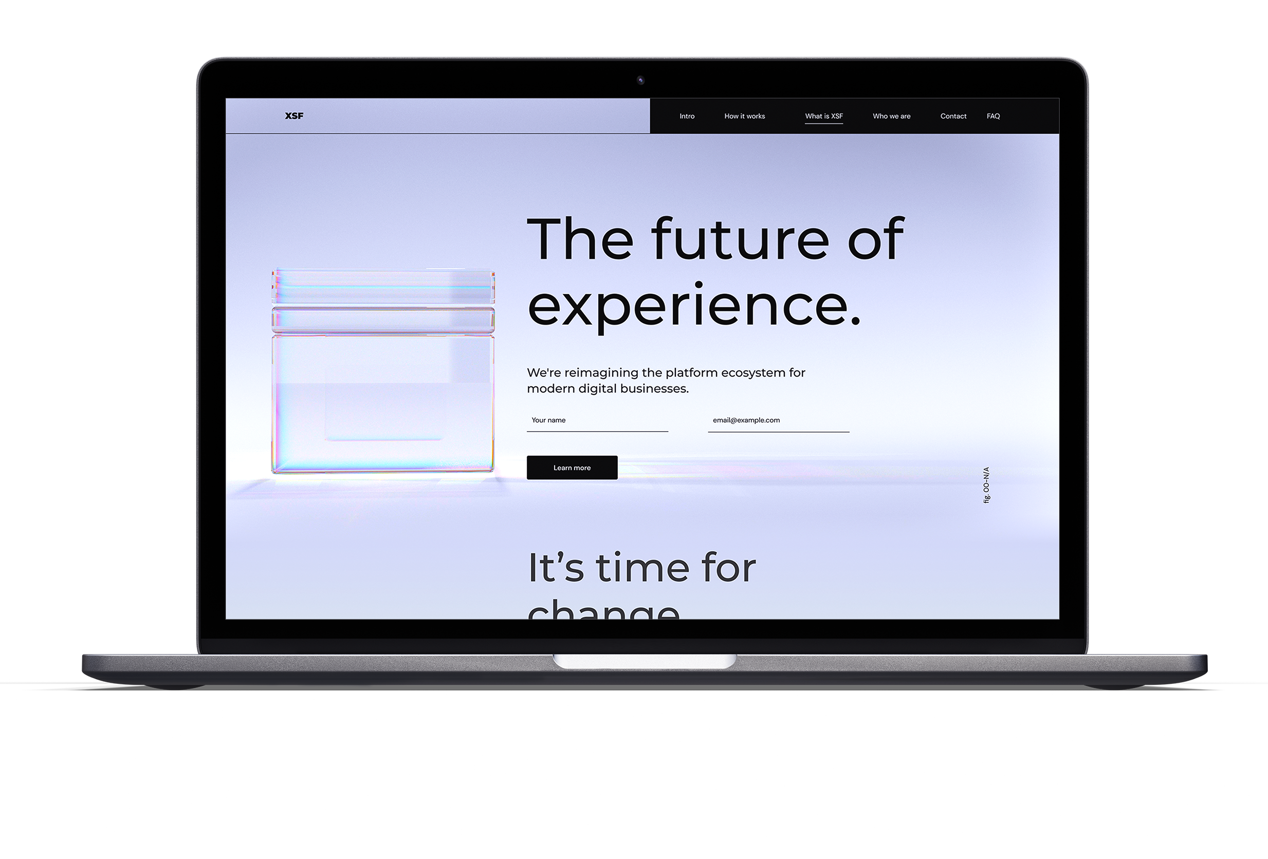
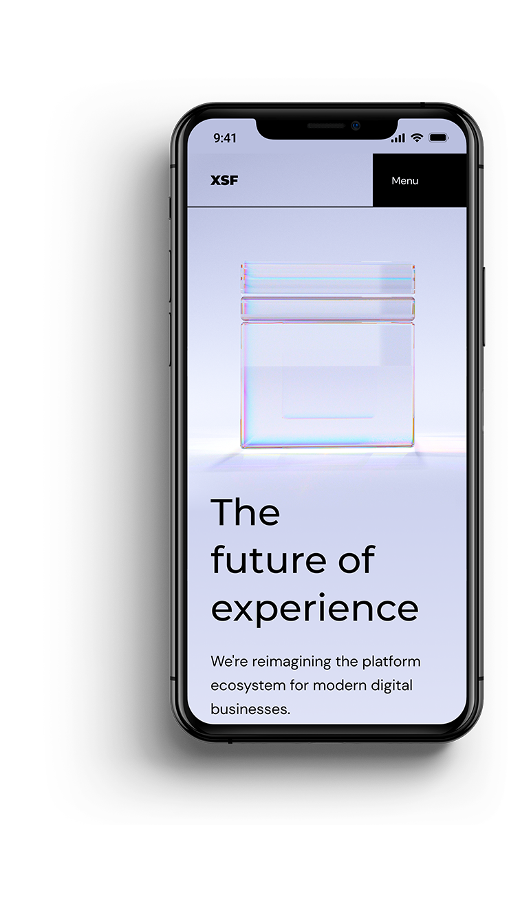
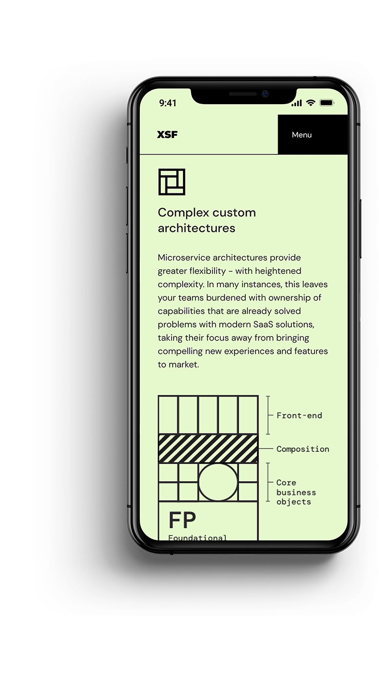
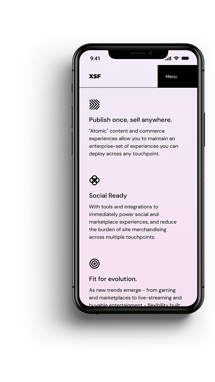
Communicating complexity
The website's purpose was to effectively communicate a highly complex service and concept to a very specific audience. For this to be possible we had to balance the use of a simple metaphor to communicate the concept but also use diagrams to explain in more detail. Along the scroll we would have to alternate these two resources to enhance the storytelling.
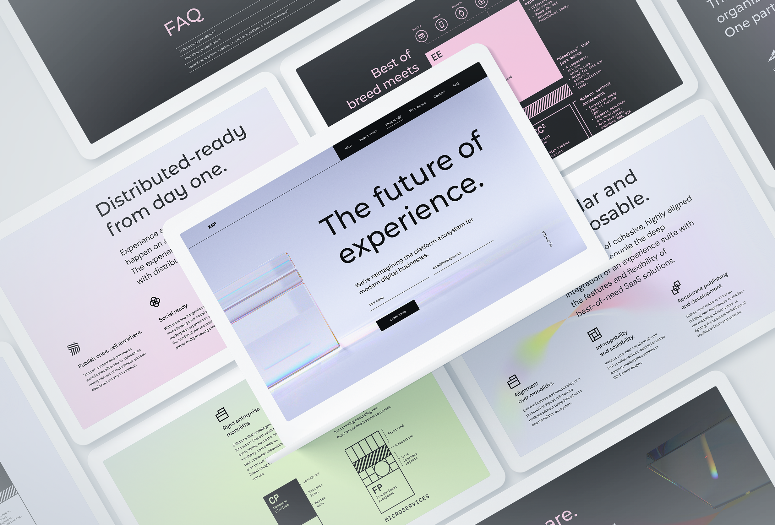
One long scroll
The content and the offer had to be told in one scroll, so that readers could scan and read the content vertically, on any device. The design was defined for desktop, tablet and mobile breakpoints. The levels of complexity would also be alternated along the scroll, alternating between the two resources we were using: the 2D diagrams and the 3D prisms.
1 month project.
Credits, Resources and Tools
Team
Huge
Bryan Lee (Creative Director), Julian Betancourt (Motion and Visual Designer).
Resources and Tools
Fonts
Montserrat, Google Fonts. Designed by Julieta Ulanovsky, Sol Matas, Juan Pablo del Peral, Jacques Le Bailly. https://fonts.google.com/specimen/Montserrat
DM Sans, Google Fonts. Designed by Colophon Foundry, Jonny Pinhorn, Indian Type Foundry. https://fonts.google.com/specimen/DM+Sans
DM Mono, Google Fonts. Designed by Colophon Foundry. https://fonts.google.com/specimen/DM+Mono
Tools
Figma. https://www.figma.com
Cinema 4D. https://www.maxon.net
Adobe Illustrator. https://www.adobe.com
Adobe Photoshop. https://www.adobe.com
This was a short, fast-paced project with technical and art-direction complexities.
Lessons Learned
Process
Try to understand the technology used as platform.
Not only in this project but also in others, not having accessed the CMS platform before fully engaging with the design process acted as a risk for the project's factibility. Sometimes fully relying on the engineering side of the project, specially with trust built with time, is not enough. To aliviate this risk, designers should consider the sometimes big effort of setting some time to get into the platform and have a sense of how it works and what would be possible and what would imply some risk.
Process
Be cautious of the effort when balancing more than one project at once.
Even when there's the best intentions, we designers can underestimate the level of time that would be needed to engage with more than one project at once. We can easily be overwhelmed with the work, either by doing the hands-on work or by supervising. Estimate by allocating the necessary buffer time and then commit to the acquired responsibilities.
Made with Semplice and with ❤︎
Contact
If you want to get in touch, just reach out on any of the following:
© 2025 Juan Piñeres


